Why it mattered
Entytle's Insyghts users are primarily sales managers. Onboarding needs to create a strong first impression and get them into the product without turning security into a guessing game. Unlike many B2C products, B2B platforms often still depend on internal email-password authentication, so the password flow has to work harder.
Signal
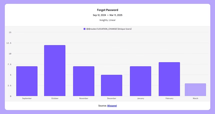
7
users went to forgot password in the last 6 months
Cost
11h
estimated yearly time lost to password-creation friction
Audit
20+
B2B and enterprise password forms reviewed
The problem
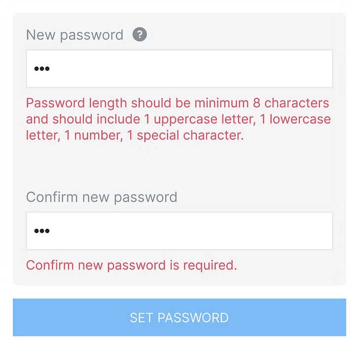
The existing form relied too much on on-exit validation. Users would finish typing, leave the field, and then discover the rules. That made instructions feel like mistakes. The study split the problem into three UX questions:
Requirements
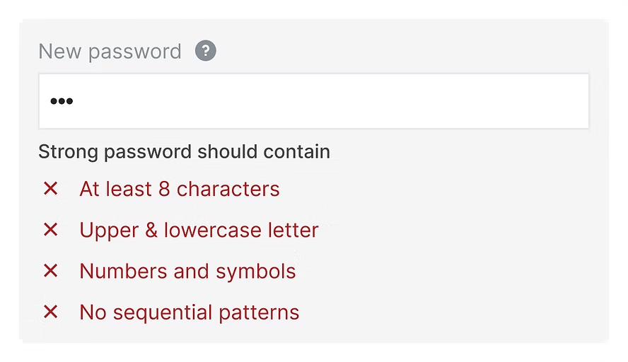
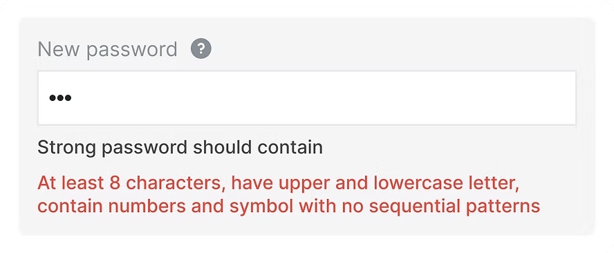
Due to on-exit validation, the form throws errors after typing. The message reads like a mistake instead of an instruction.
Show/Hide
Users make mistakes, and no clear validation or intentional show-password control is a big risk for password entry.
Strength
The user has no simple answer to the key question: how strong is this password?
Research direction
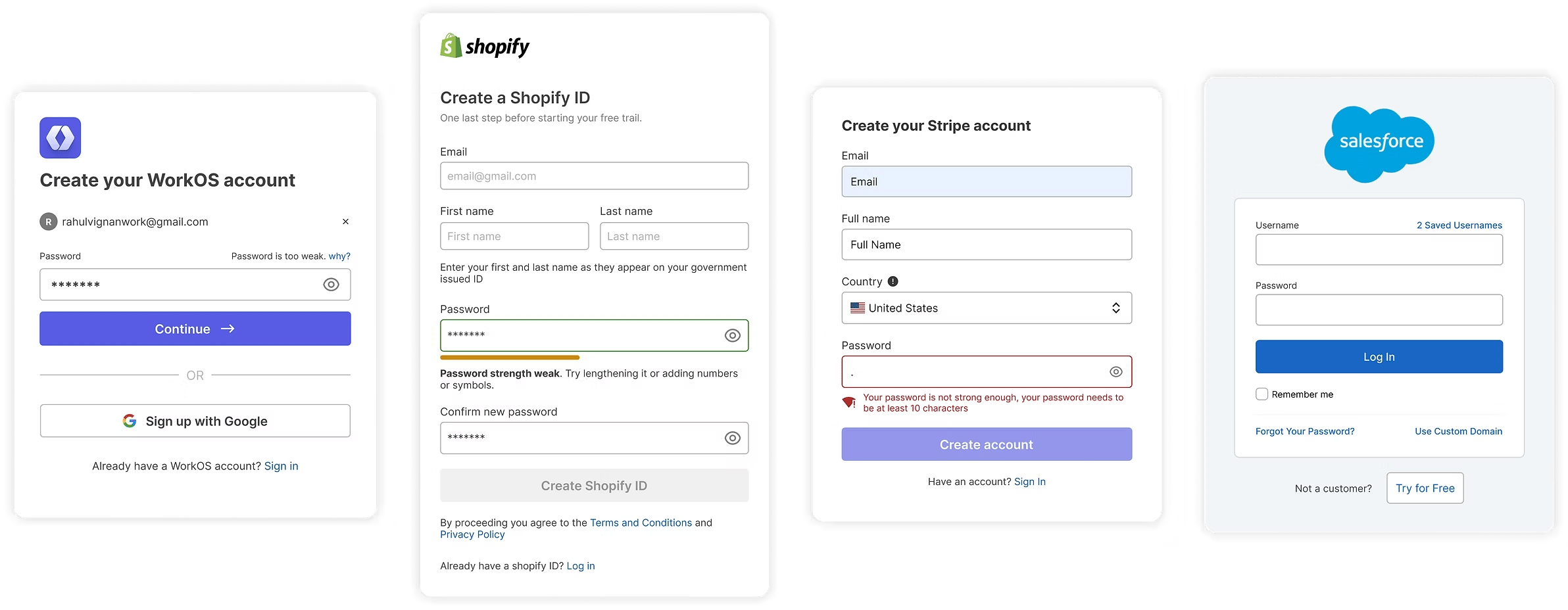
I audited 20+ B2B and enterprise forms, comparing requirement patterns, error states, show-password controls, and strength indicators. The goal was not to reinvent password creation. It was to reduce friction while keeping security expectations clear.
Design decisions
The final direction prioritised clarity over cleverness: fewer rules, clearer copy, live validation, explicit show-password behavior, and a familiar strength meter.
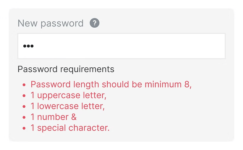
Try 1: visible requirements
- Pro
- Full clarity up-front. Checking off each requirement can feel satisfying when the visual state improves as the user types.
- Cons
- Text-heavy and demanding on attention, especially before the user understands why every rule matters.
- Decision
- Keep the clarity, but reduce the weight through copy and visual treatment.
UX copy
Clear without sounding forceful
I decided against language like “your password must contain” because it sounded too mandatory. The goal was to improve password security while keeping the tone professional, motivating, and easy to act on.
“Strong password should contain” was selected because it aligns with the need for clear, authoritative instructions in an enterprise setting where security is paramount.
Tech side
9
- Minimum 8 character
- 1 uppercase
- 1 lowercase
- 1 number
- 1 special character
- Can't contain spaces
- Can't contain 4 repeated, sequential character
- Can't contain email username ${username}
- Should not be within top 10K common passwords
Existing
5
- Minimum 8 character
- 1 uppercase
- 1 lowercase
- 1 number
- 1 special character
Finalised on UI
4
- At least 8 characters
- Upper & Lower case letters
- A symbol
- No sequential patterns
Chapter 2 · How
Improving requirements visually
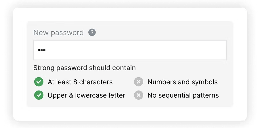
The direction started moving toward a checkable component: enough clarity to guide users, but lighter than a long red error paragraph.
Chapter 3 · Detail
Icon selection
The initial icon was both inaccessible and too high in contrast, so it never read as an initial state. I ended up going with a lighter shade and an x-mark, as it felt most opposite to a checkmark.
Starting point
Strong password should contain:
- At least 8 characters
- Upper & lowercase letter
- Numbers and symbols
- No sequential patterns
Too much contrast, doesn't feel like an initial state.
Icon choices for unmet requirement
Strong password should contain:
- At least 8 characters
- Upper & lowercase letter
- Numbers and symbols
- No sequential patterns
Empty circle
Strong password should contain:
- At least 8 characters
- Upper & lowercase letter
- Numbers and symbols
- No sequential patterns
Exclamation circle
Strong password should contain:
- At least 8 characters
- Upper & lowercase letter
- Numbers and symbols
- No sequential patterns
Warning triangle
Strong password should contain:
- At least 8 characters
- Upper & lowercase letter
- Numbers and symbols
- No sequential patterns
Cross circleChosen
Chapter 4 · Outcome
Safer initial states
This new initial state is much less aggressive, and it is clearer to the customer that these are requirements still to meet. Research also shows that the length of a password matters more than the requirements listed.
Password requirement:
- At least 8 characters
- Upper & lowercase letter
- Numbers and symbols
- No sequential patterns
Feels like an error state
Strong password should contain:
- At least 8 characters
- Upper & lowercase letter
- Numbers and symbols
- No sequential patterns
Feels like an initial state
Chapter 5 · How
Add “Show/Hide”
Show/Hide
Users make mistakes, and no clear validation or intentional show-password control is a big risk for password entry.
Allow password unmasking
Seeing the password supports memory and lets users check their own work.
Another downside to masked inputs is that they cover up typos the user may not have noticed. That matters more than it sounds, because many people create passwords on phones and tablets, and research shows more typing errors on smaller devices than on desktop computers (Von Zezschwitz, 2014).
This can be done in three ways.
- 1.Eye button
- 2.Eye + text button
- 3.Text button
The eye icon dilemma
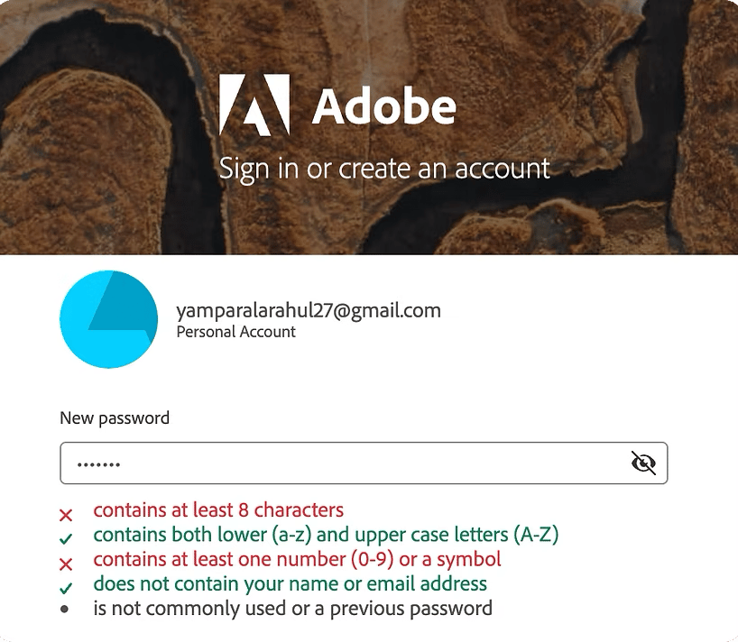
There are a number of variations on the “unmasking eye” icon, but they mostly share the same problem. Some examples:
- Eye
- Eye with slash
- Closed eye
The problem arises from inconsistent use of this icon across different platforms.
Crossed-out eye while hidden
The open eye means the password is visible. Clicking it closes the eye and masks the password again.
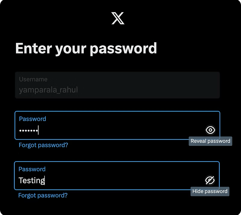
Open eye while hidden
The open eye means the password is hidden. Clicking it reveals the password and crosses the eye out.
The same icon carries opposite meanings, which is confusing for anyone who moves between services regularly.
Solutions to the eye icon issue
Strong password should contain
- At least 8 characters
- Upper & lowercase letter
- Numbers and symbols
- No sequential patterns
Swap icon with text
Strong password should contain
- At least 8 characters
- Upper & lowercase letter
- Numbers and symbols
- No sequential patterns
Supplement with text
Strong password should contain
- At least 8 characters
- Upper & lowercase letter
- Numbers and symbols
- No sequential patterns
Consider checkbox buttonChosen
Chosen: the checkbox
A checkbox is the best of the three, for three reasons.
Clarity and accessibility
The text “Show password” is more explicit and easier to understand for everyone, including people who are not familiar with the eye symbol. It removes the ambiguity entirely.
Avoiding potential confusion
The eye icon can be misinterpreted: users cannot tell whether it reports the current state of the password or the action that will happen when they click it.
Security considerations
Letting people view their password is helpful, but it should be deliberate. A clear text control encourages more thoughtful use of it.
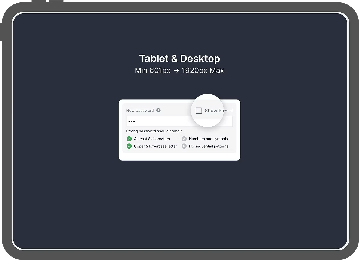
How the checkbox behaves by device
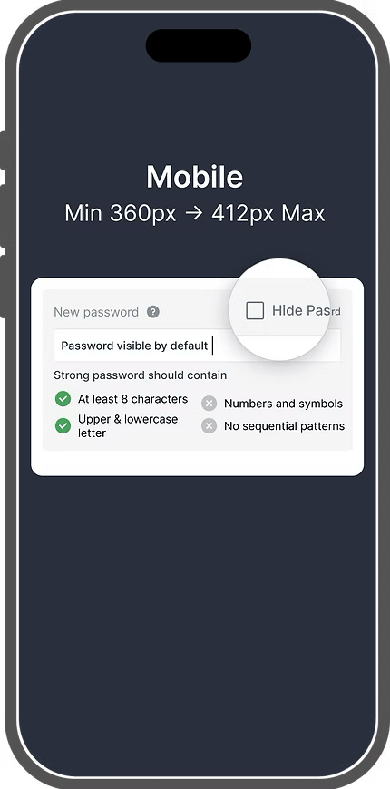
On mobile, unmask the password by default and offer a Hide option instead. Typing a complex, secure password on a phone is hard enough already.
Unmasking on mobile does not hurt security much in practice. The keyboard already shows exactly which letters were typed.
On desktop, mask by default and offer a Show option, so people can still recall the password and check their work.
Chapter 6 · How
Add a strength indicator
Detailed composition requirements force people through what feel like arbitrary hoops. They comply because the form makes them, then settle on an easily guessable phrase. Satisfying the rules does not necessarily produce a secure password when someone is inventing one just to get past the registration screen.
Strong password should contain
- At least 8 characters
- Upper & lowercase letter
- Numbers and symbols
- No sequential patterns
The solution: motivate people to create better passwords by showing how secure the password already is. A study by Egelman et al. (2013) found that strength meters did lead users to create stronger passwords.
Reaching the full green bar also adds a modicum of satisfaction to an otherwise joyless task: gamification used for good. More generally, focusing on the benefits is an effective way of persuading users to use your product.
I wanted to give a sense of progress and close the feedback loop, so every keystroke returns an immediate signal. I examined several kinds of bars and meters. The other benefit is certainty: people can see what is still missing before the password counts as strong.
Visual tries
T1
Strong password should contain
- At least 8 characters
- Upper & lowercase letter
- Numbers and symbols
- No sequential patterns
Strong password should contain
- At least 8 characters
- Upper & lowercase letter
- Numbers and symbols
- No sequential patterns
Strong password should contain
- At least 8 characters
- Upper & lowercase letter
- Numbers and symbols
- No sequential patterns
- Pro
- Looks clean and simple.
- Con
- Complex to implement, and it collides with the error state.
T2
Strong password should contain
- At least 8 characters
- Upper & lowercase letter
- Numbers and symbols
- No sequential patterns
Strong password should contain
- At least 8 characters
- Upper & lowercase letter
- Numbers and symbols
- No sequential patterns
Strong password should contain
- At least 8 characters
- Upper & lowercase letter
- Numbers and symbols
- No sequential patterns
- Pro
- Supports the moment visually, with the satisfaction of getting there.
- Con
- Checking the conditions from the backend can be costly at a large user base.
Chosen: the progress bar
Familiarity and simplicity
People are used to progress bars in all sorts of contexts, which makes this intuitive and easy to read.
Incremental feedback
As someone types, the bar fills dynamically, encouraging them to keep improving the password until it reaches the strong zone.
Colour feedback
The colour can move from red (weak) to green (strong), giving a clear visual cue about where the password stands.
Proven effectiveness
Studies show that progress-bar visualisations help people create longer, more complex passwords than no feedback at all, or than less familiar visualisations such as gauges and step indicators.
Encouraging without mandating
The other part of this feature is a small indication that appears once someone leaves the password field. It is a small element, but it was not easy to get right: it has to let the user know they can continue, while still encouraging them to come back and make the password stronger.
Strong password should contain
- At least 8 characters
- Upper & lowercase letter
- Numbers and symbols
- No sequential patterns
Learnings & impact
Product shipped
For the experience to feel seamless, accessible forms with carefully considered interactions were what let everyone fill the form in quickly. This is the shipped field: type into it and every rule, the bar and the colour respond as you go.
Strong password should contain
- At least 8 charactersnot met
- Upper & lowercase letternot met
- Numbers and symbolsnot met
- No sequential patternsnot met
Learning
The case study's main lesson is that accessible form design is detail work. A small password field carries copy, validation, state, security perception, memory support, and user confidence. When those details work together, the product feels easier before users even reach the dashboard.